Election Maps by State
and County
(The following is only
included, in order to demonstrate the amount of high silliness that goes on in
URL Land.) The following
URL:
has a length of 680 characters and resulted in the following TinyURL which has
a length of 26 characters: http://tinyurl.com/ab2rauj
For a detailed look at the
voting decisions made state by state, county
by county, red to blue, this series of interactive maps from The
Washington Post
provides a 3-D version of the margin of victory
in this presidential election and then some.Any surprises?
Tags: 2008 election, blue state, election map, red state


And the
blue wins?
______________________________________________________________________
Cartogram Maps of the 2012 US Presidential
Election Results
(More high silliness
that goes on in URL Land.) The
following URL:
has a length of 527 characters and resulted in the following TinyURL, which
has a length of 26 characters: http://tinyurl.com/b58tsk8
(Thanks for all the emails. New county-by-county
maps are on the way soon.)
Election results by state
Most
of us are, by now, familiar with the maps the TV channels and web sites use to
show the results of presidential elections. Here is a typical map of the
results of the 2012 election: 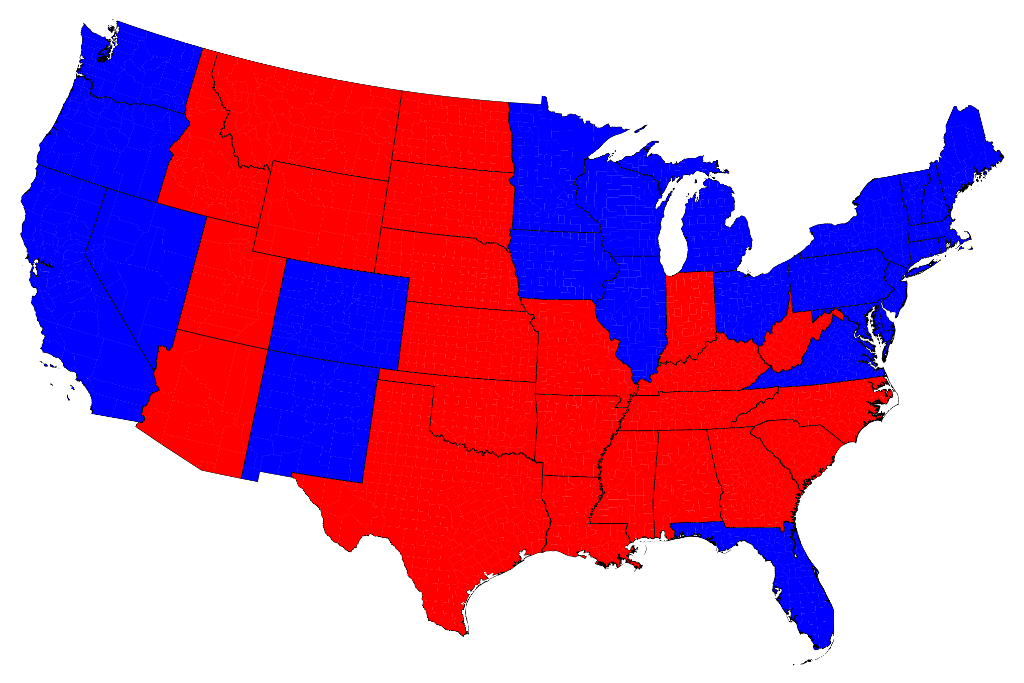
Click on any of the maps for a larger picture
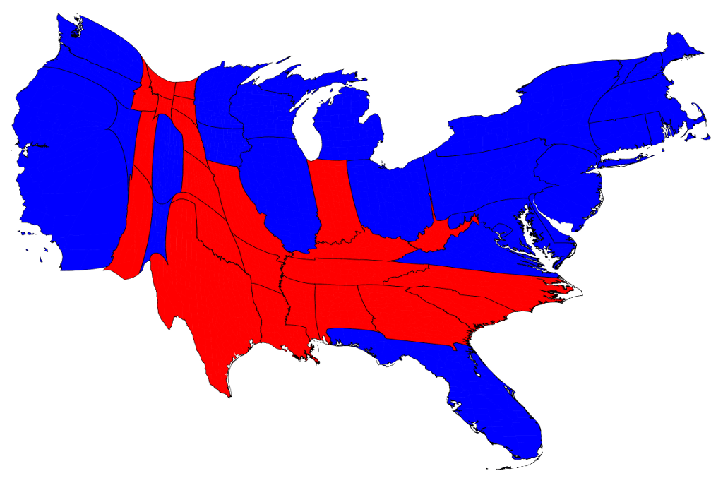
We can correct for this by making use of a cartogram, a map in which the sizes of states are rescaled according to their population. That is, states are drawn with size proportional not to their acreage but to the number of their inhabitants, states with more people appearing larger than states with fewer, regardless of their actual area on the ground. On such a map, for example, the state of Rhode Island, with its 1.1 million inhabitants, would appear about twice the size of Wyoming, which has half a million, even though Wyoming has 60 times the acreage of Rhode Island.
Here are the 2012 presidential election results on a population cartogram of this type:
The presidential election, however, is not actually decided on the basis of the number of people who vote for each candidate but on the basis of the electoral college. Under the US electoral system, each state in the union contributes a certain number of electors to the electoral college, who vote according to the majority in their state. (Exceptions are the states of Maine and Nebraska, which use a different formula that allows them to split their electoral votes between candidates.) The candidate receiving a majority of the votes in the electoral college wins the election. The electors are apportioned among the states roughly according to population, as measured by the census, but with a small but deliberate bias in favor of smaller states.
We can represent the effects of the electoral college by scaling the sizes of states to be proportional to their number of electoral votes, which gives a map that looks like this:

The areas of red and blue on the cartogram are now proportional to the actual numbers of electoral votes won by each candidate. Thus this map shows at a glance both which states went to which candidate and which candidate won more electoral college votes – something that you cannot tell easily from the normal election-night red and blue map.
In principle, one could also make similar maps of the county-by-county election returns, but the county results are not yet available for the 2012 election. Watch this space in the next day or two for new county-level maps.
Notes:
Frequently asked questions (FAQs): A list
of frequently asked questions concerning these maps, along with answers, can be
found here.
Software: My computer software for producing cartograms is freely available here.

This work is licensed under a Creative Commons License. Text and images may be freely distributed. I'd appreciate hearing from you if you make use of them.
Mark Newman, Department of Physics and Center for the Study of Complex Systems, University of Michigan
Email: mejn@umich.edu
Updated: November 7, 2012


1 comment:
What is this nonsense page?!
Post a Comment